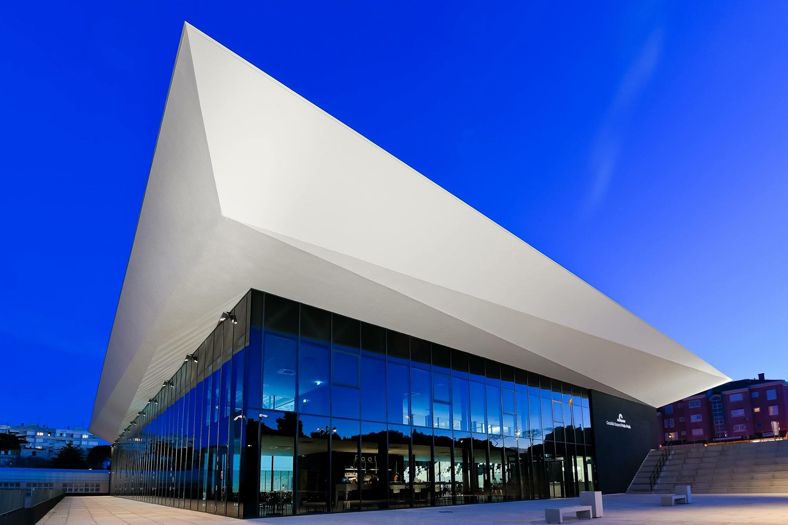

The Context
In 2018, the City of Pula equipped its sports centre with an important new facility: a new public swimming pool with a wide functional programme.
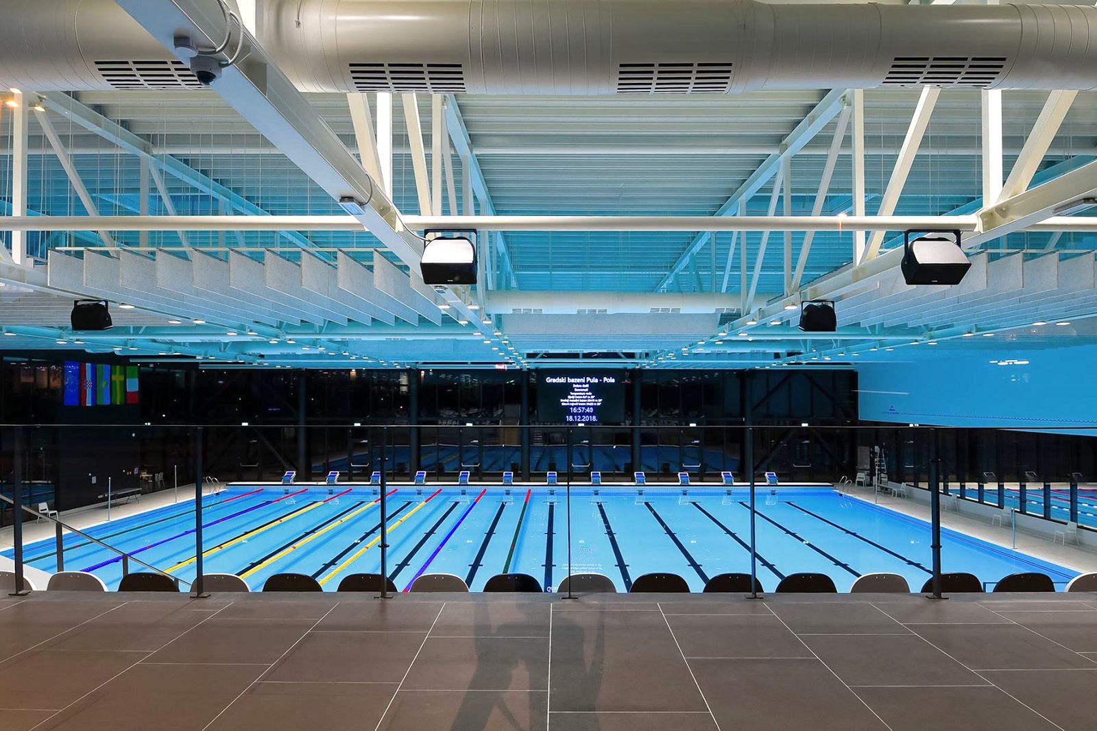
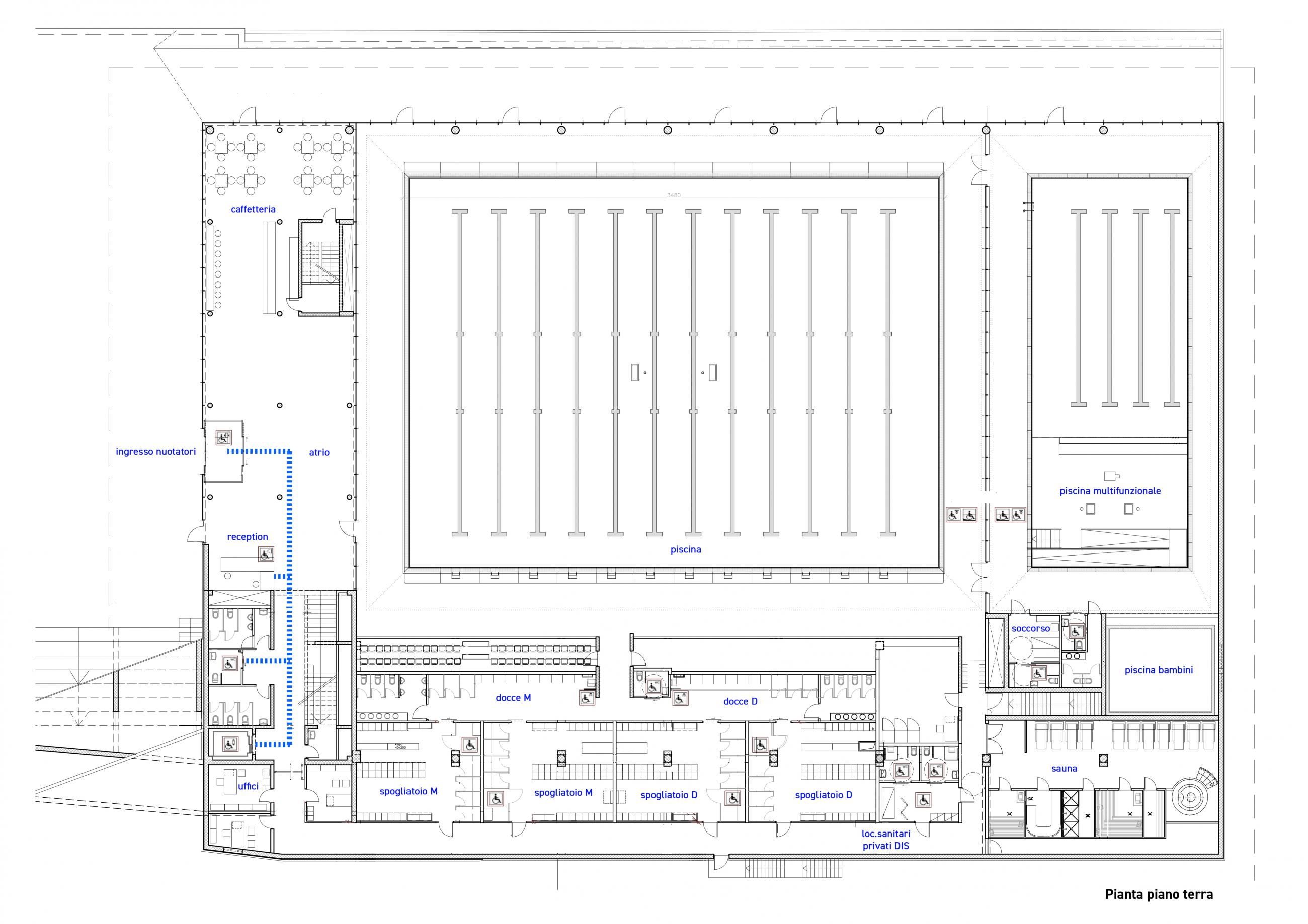
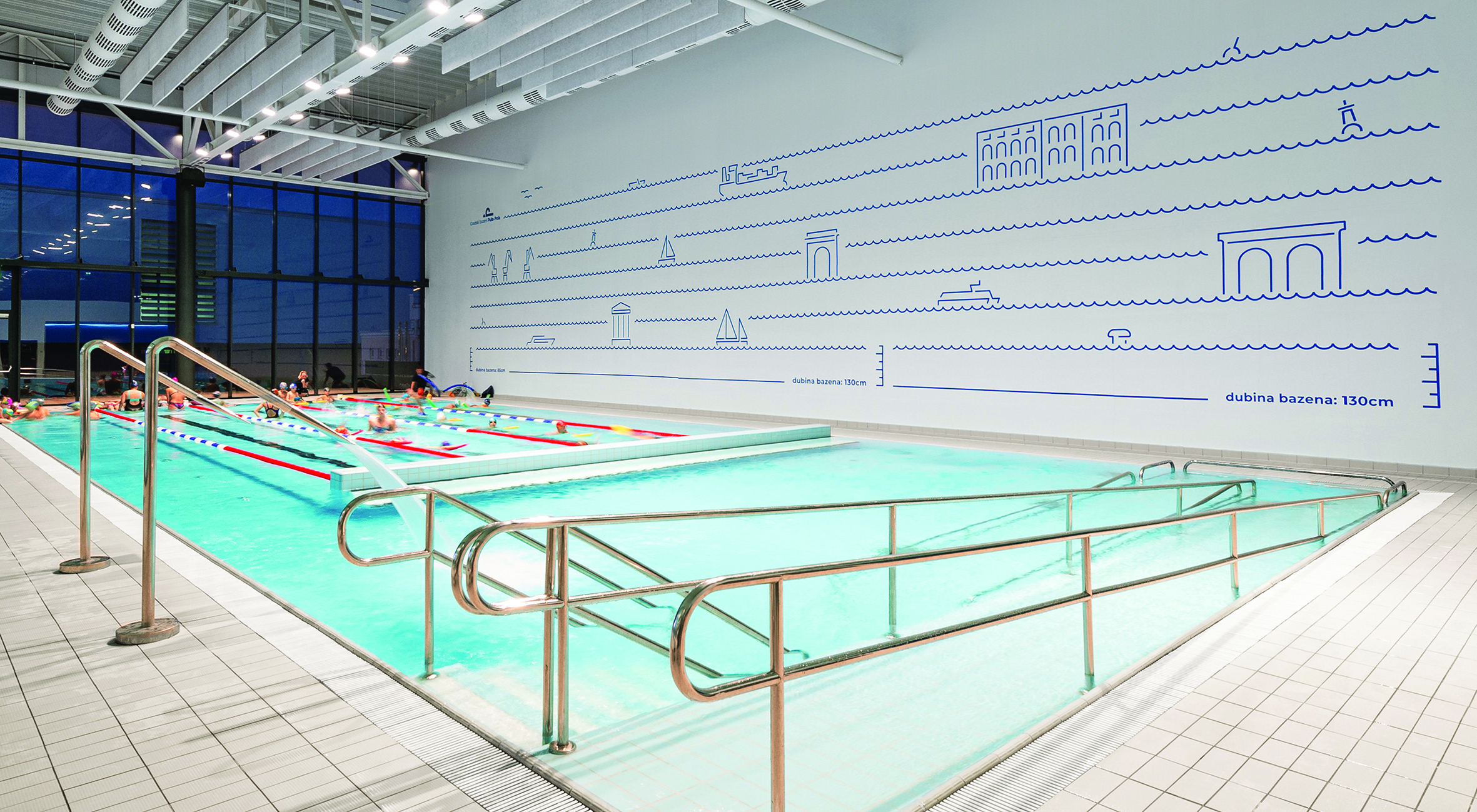
The 5'900 square meters of space include three pools, a sauna, a gym, and related sanitary rooms.
A cafeteria and a multipurpose hall add to the complex and strengthen the recreational opportunities of a place open to sportspersons and other citizens.
Because of the many activities it conducts and its key role as a community centre for the town of Veruda, the facility attracts a wide audience, with different target and age groups.
Architectural design
The design choices clearly demonstrate the desire to make the building equally accessible to all types of users.
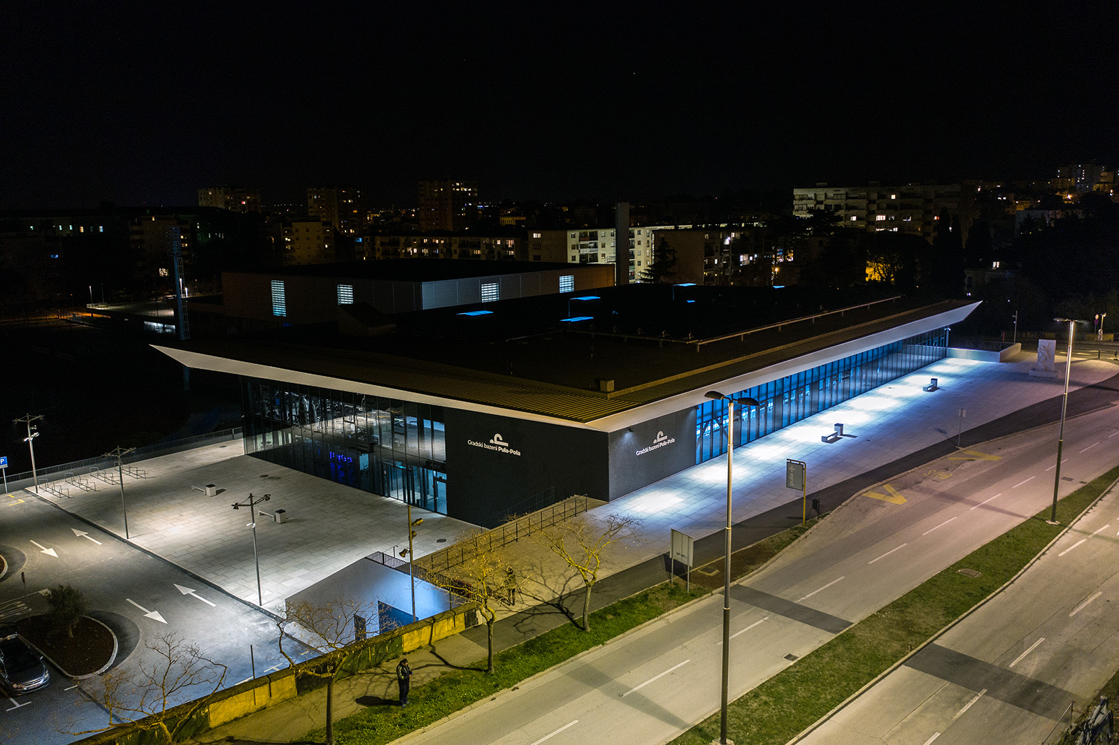
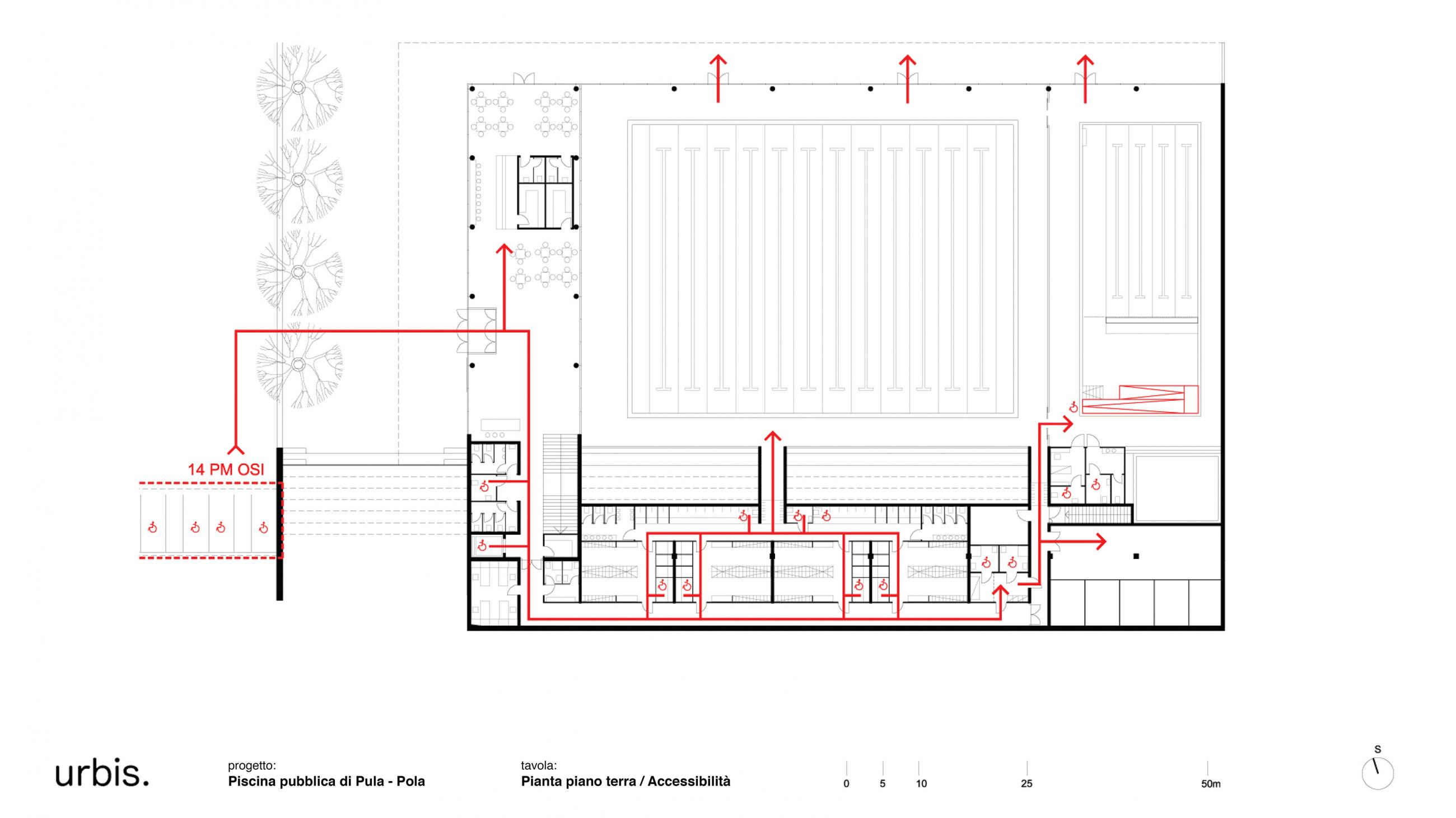
The sports facilities are dispersed across two floors. Differences in elevation between floor levels are resolved through a strict distribution system and a clear hierarchy of access.
The main and accessible entrance is directly connected to the public parking on the ground floor at a lower elevation than the public road. Likewise, the lobby, the cafeteria, and the reception are accessible to persons with disabilities, with 40% of the parking spaces being dedicated to them.
The reception is accessible for those with visual impairments thanks to a tactile pathway that starts at the entrance revolving door and ends at the counter. The latter, which has two heights, is intended for individuals in wheelchairs, different tallness, and children.
The tactile guidance system continues towards the toilets and the lift, without being excessive or redundant. In other areas of the pool, in fact, the architectural elements (corridors, baseboards, door frames, etc.) and chromatic parts that ensure orientation to users with visual impairments, but not only; these same elements also allow people without disabilities to use the space easily and intuitively.
The service blocks - divided between men and women - have toilets, changing rooms and showers, also suitable for people in wheelchairs (thanks to large manoeuvring clearances, handles and folding seats). Although there are sanitary facilities for the exclusive use of people with special needs, the guiding principle is inclusivity, with spaces that can be shared by all.
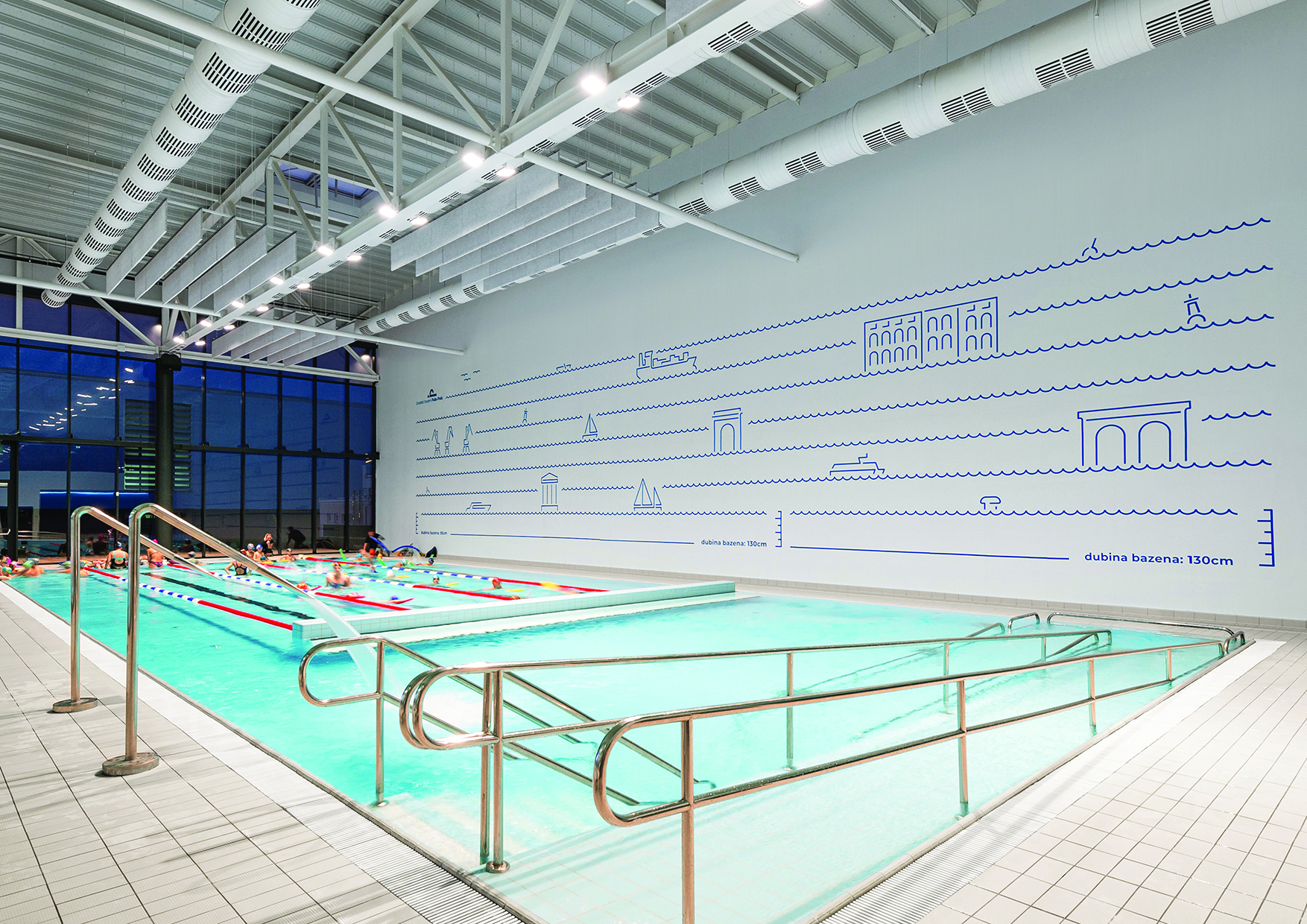
When planning the three pools, special attention was given to the multifunctional pool, which is also used for physiotherapy. It can be accessed via ladder or ramp, and it has handrails and a ceramic floor with high slip resistance. This design favours individuals with different motor skills, as well as those who want to enter freshwater more effortlessly.
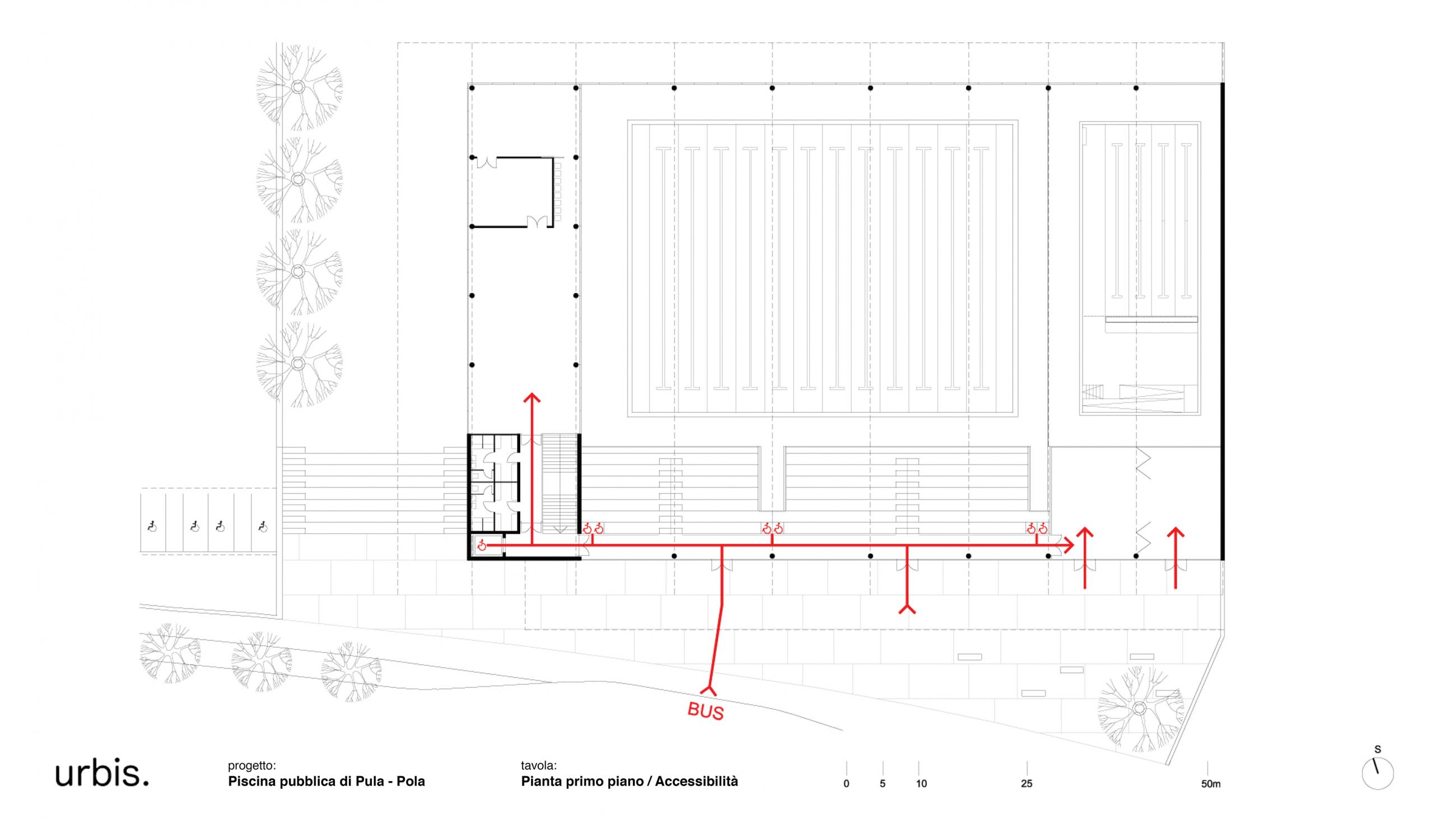
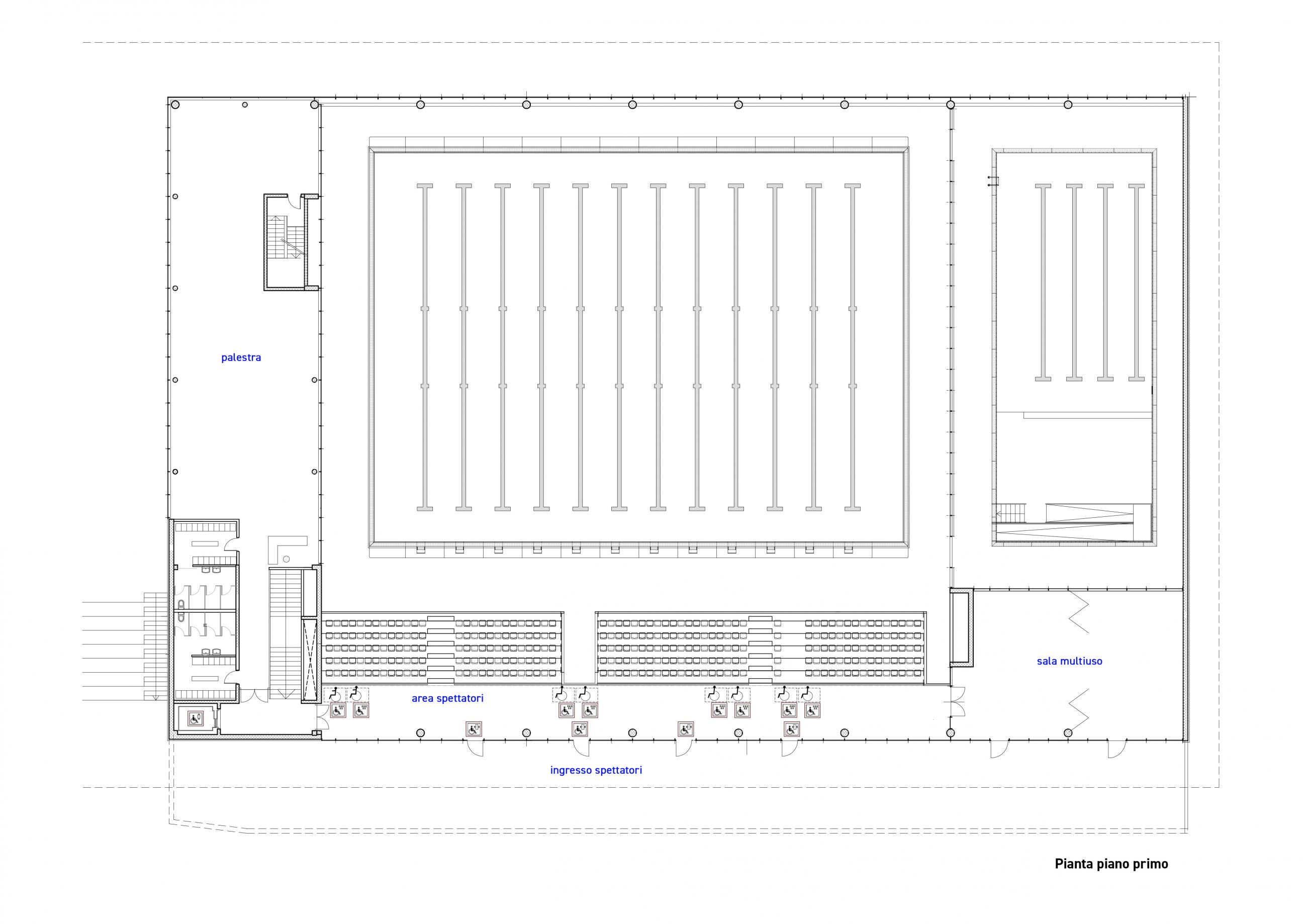
A second entrance is located on the first floor that allows access from the outside or bus zone to the multipurpose hall, gym, and lift. The stands area is also directly accessible from this side of the building and welcome spectators with disabilities. By using glass that protects without obstructing the view along with the appropriate height of the parapet, wheelchair users can watch sports events.
Branding and signage
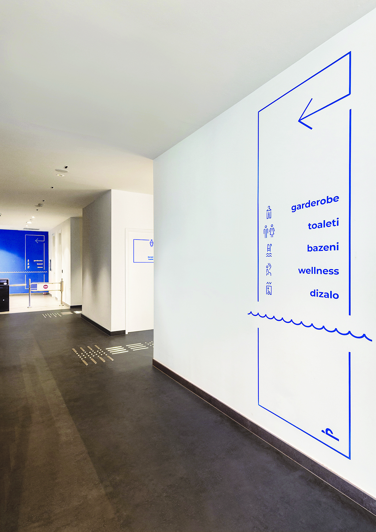
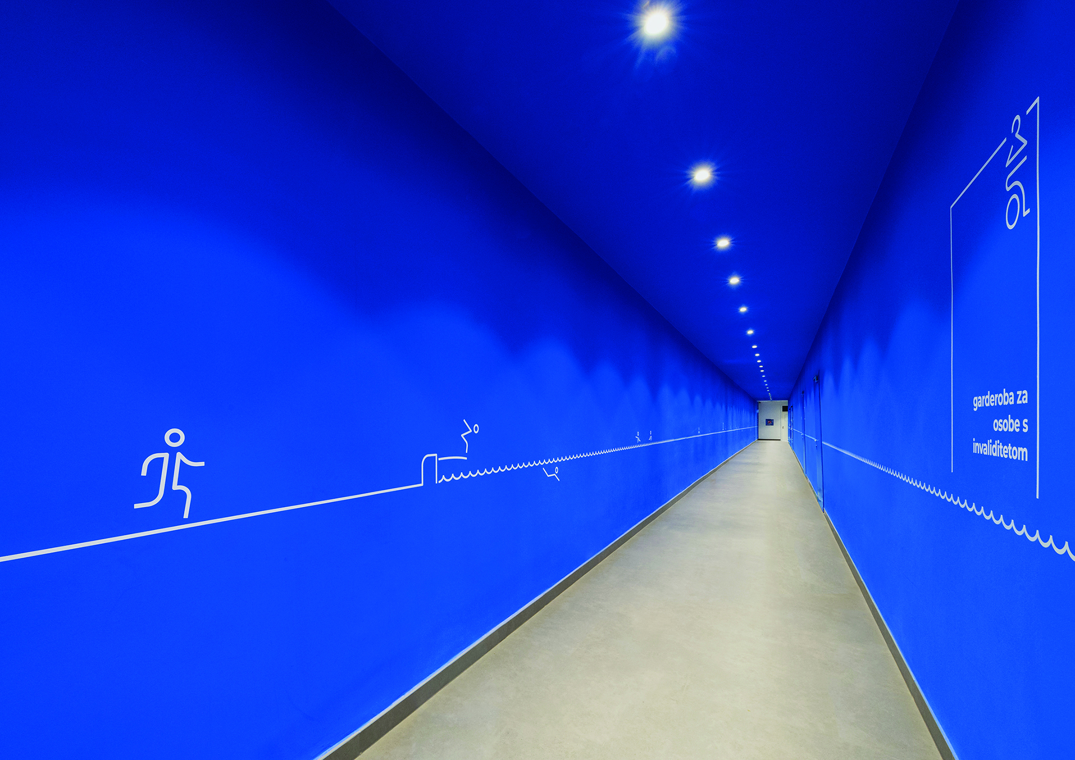
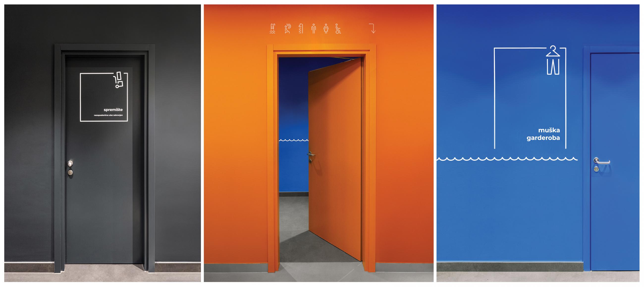
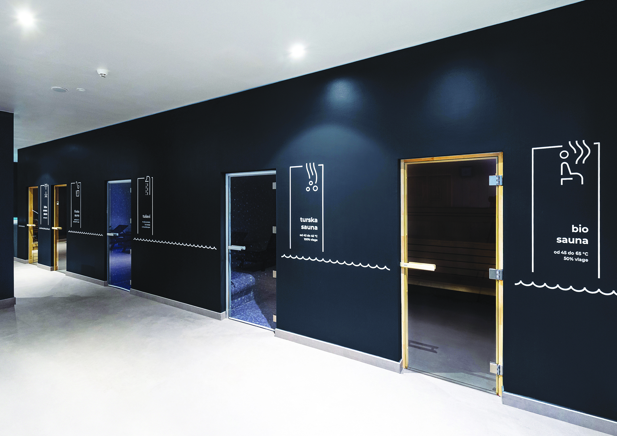
Inclusiveness is also the common thread in the development of the graphic concept, which is in turn, closely intertwined with the architectural design. Furthermore, the signage is designed to define the identity of the various areas in the building and enable the intuitive use of spaces. As a distinctive feature of the project, the designers opted for the water line, a common thread that stretches across all environments and changes, taking new shapes.
A system of icons guides the visitor through the various rooms and devices (such as the dressing room, sauna, lift, storage, and so on) along with the water line trace.
The figures have a basic pattern and are immediately recognizable, which makes it easier to navigate within the facilities. Visitors and iconography are in a dynamic relationship, as you walk through the building, the traditional illustrations come alive and bring life to the space.
The signage's design was created by carefully selecting colours so as to differentiate the various zones (the corridor towards the swimming pools is blue, the women’s dressing rooms are red, the showers are green, etc.). Similarly, the colour contrast is selected in a way to distinguish between vertical and horizontal surfaces and to make information stand out.
The project has won many awards in communication, including the Grand Prix at the European Design Awards in 2020.
Participation of end users
The architects and the graphic design team converged on the idea of involving end users in the project's design phase. The designers included the comments and requests of the disabled association of Istria, especially in the development phase of the multifunctional pool.
Similarly, by conversing with both professional and amateur swimmers, the designers gained ideas and insights that helped them create an idea that aligned with their expectations.
Consultation with future users has enriched the project and contributed to high-quality end results.
General design guidelines information (Swiss technical standards and regulations)
According to SIA 500
- Pool: entrance ladder with steps, raised max cm 15 and handrails on both sides at a distance of 60-65 cm.
- Recognition and marking: steps and stairs shall be marked with marking that is distinctive from the rest of the coating with a brightness contrast of priority level I, preferably light on dark.
- Sanitary rooms suitable for wheelchairs: bathroom min. 165x180 cm; bathroom with shower min. 180x180 cm; cabin in collective showers min. 90x140 cm; dressing room with surface min. 4 sqm, side min. 180 cm. All equipped.
-Stands for spectators: space available for a wheelchair min. 110x140 cm.
-Counter: at least one worktop with h from the ground between 72 and 76 cm and under top of at least 70 cm.
According to SN 640 852
Visual tactile marking is a marking that has perfect contrast, consists of varying textures and raised characters, and is easily recognizable through white stick, touch, feet, and vision. It includes tactile lines, junctions, end points as well as attention zones.
Text by Caterina Cavo